Family Photoshoot Northampton
If you’re left frustrated by mobile phone or school photos and would love some professional family photography that truly captures your family’s personality in astonishing detail… then we could be a perfect fit.
It’s all about your family’s natural personality and character… no novelty props or outfits are needed at your family photoshoot.
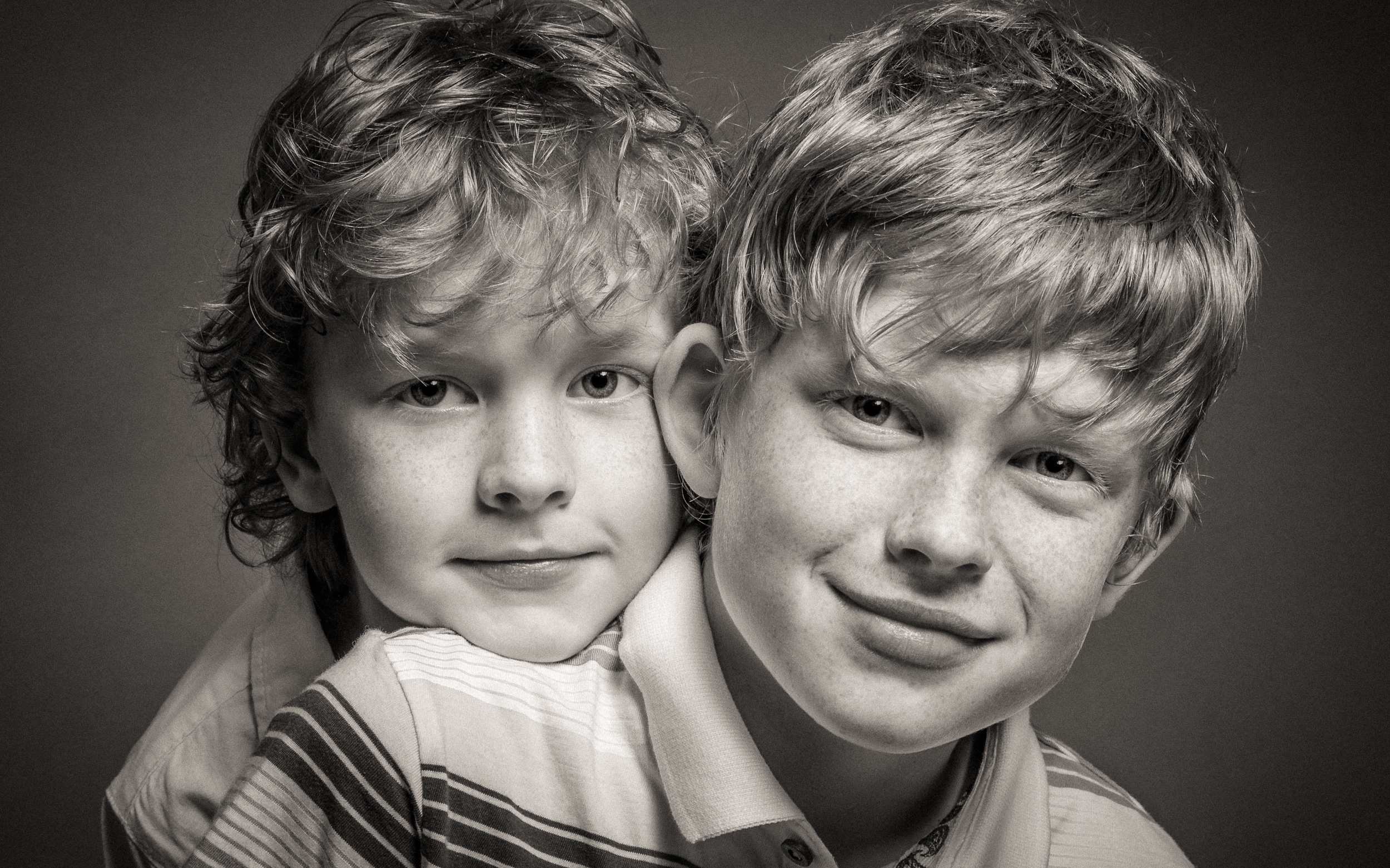
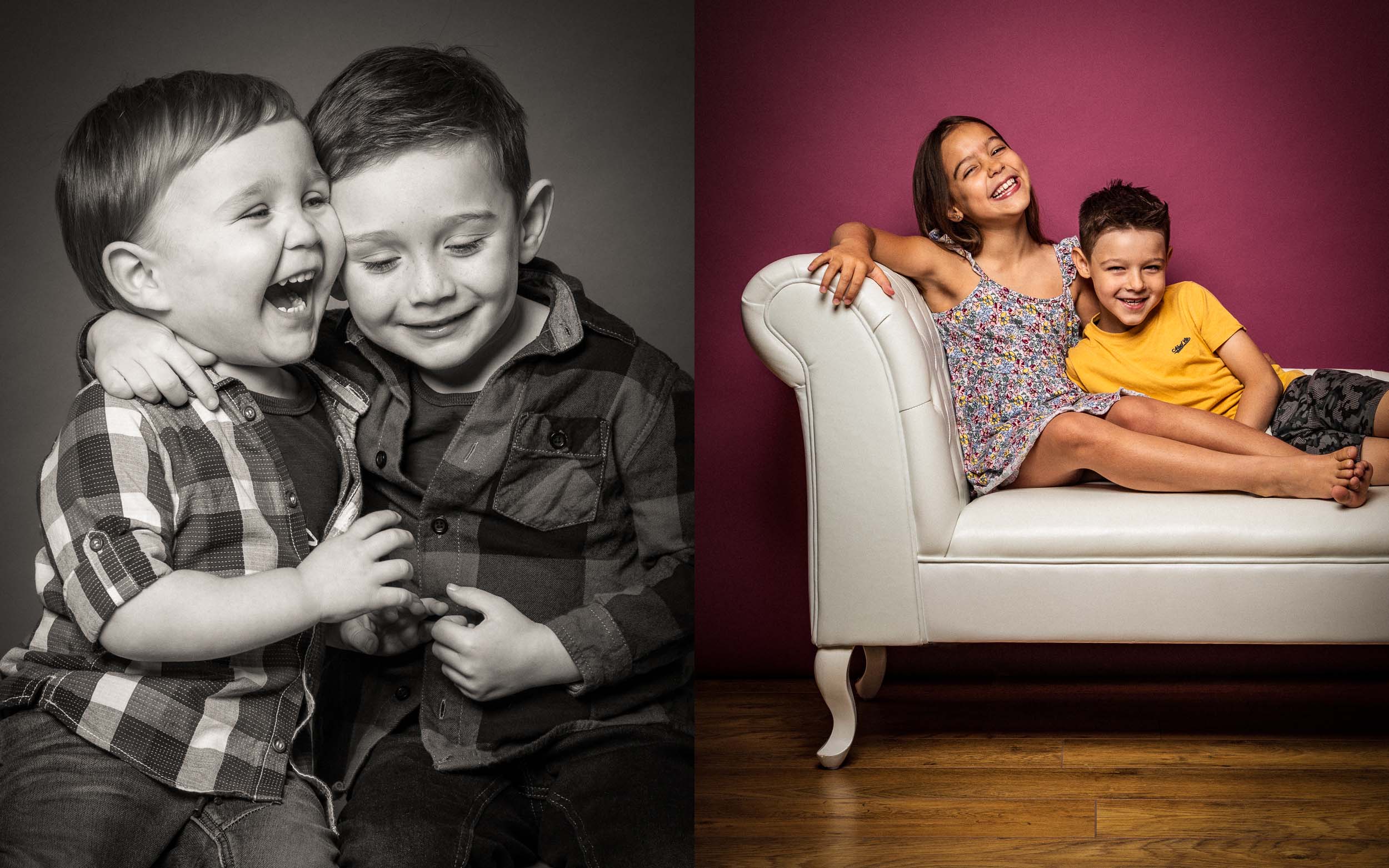
I’ve been a professional photographer for 25 years, developing my own distinct style of family portrait photography. Working from my Northampton Studio, my unique approach concentrates on building a strong rapport with your children and then capturing their natural expressions with contemporary portraiture.
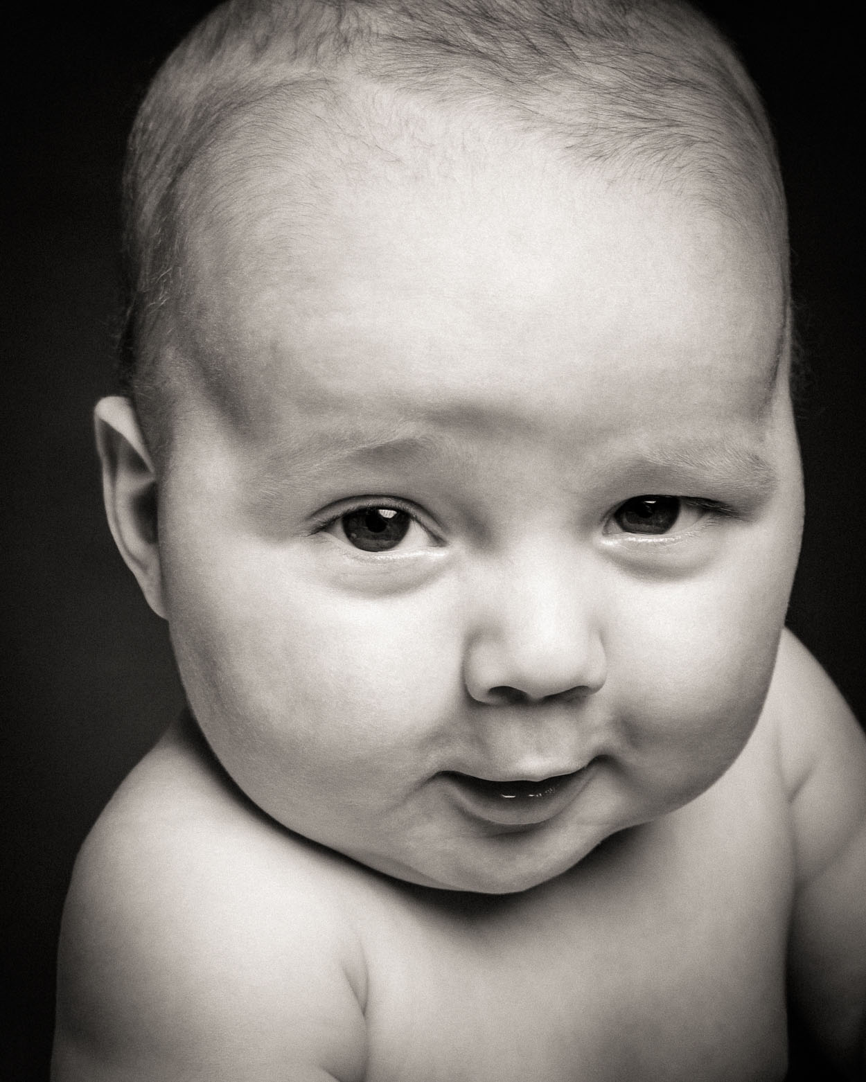
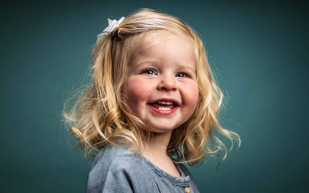
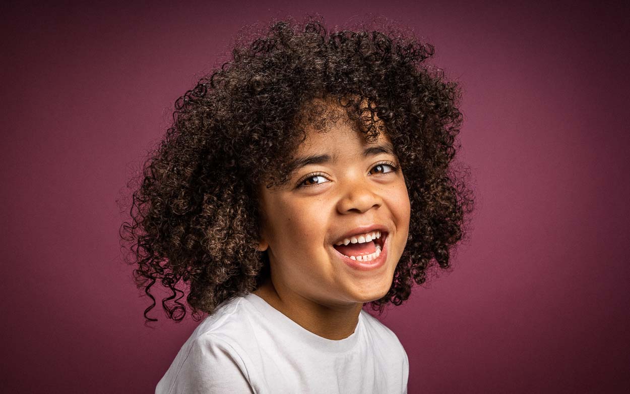
“Over 100 Families Photographed”
Andy has been photographing children professionally for the past 12 years.
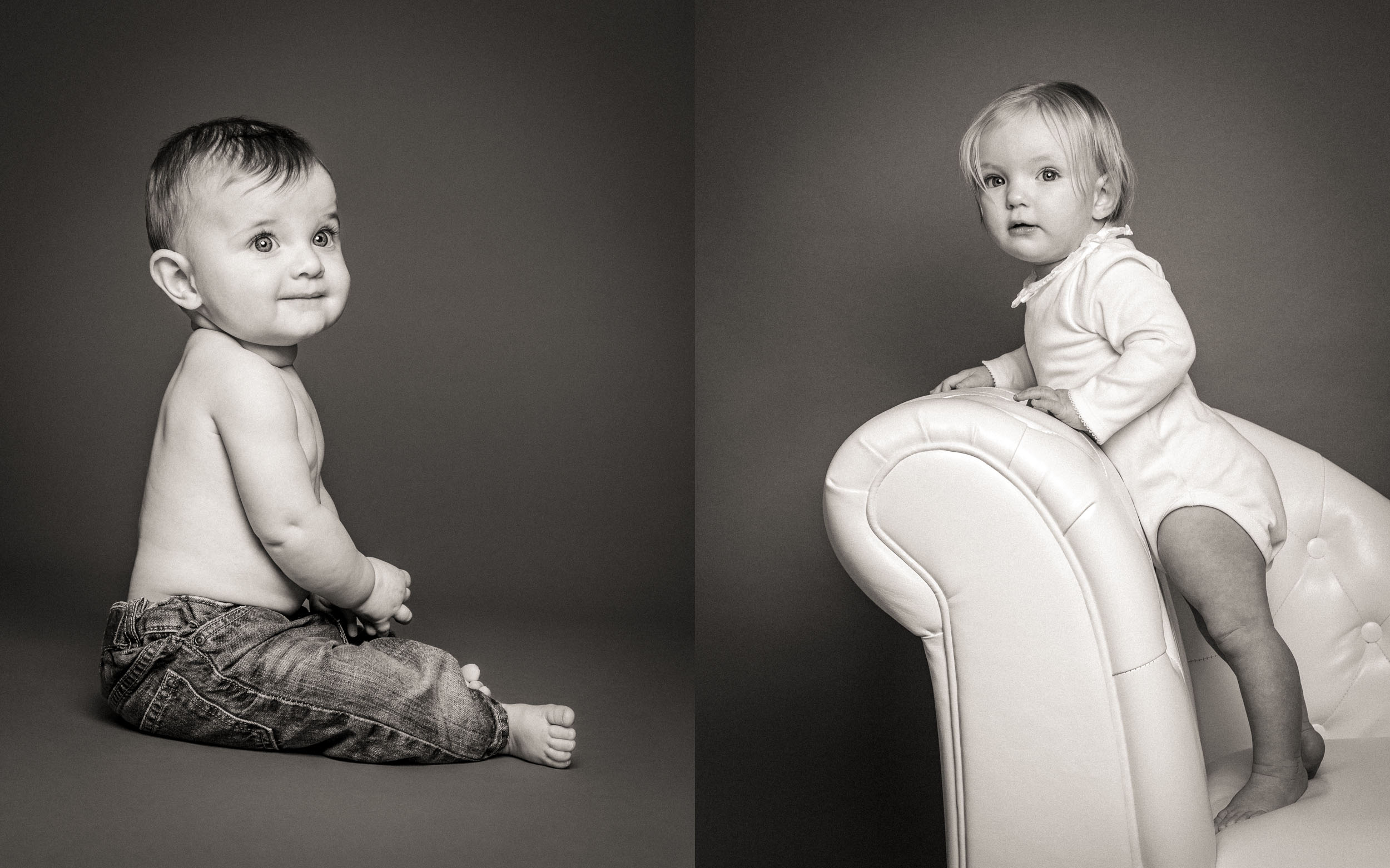
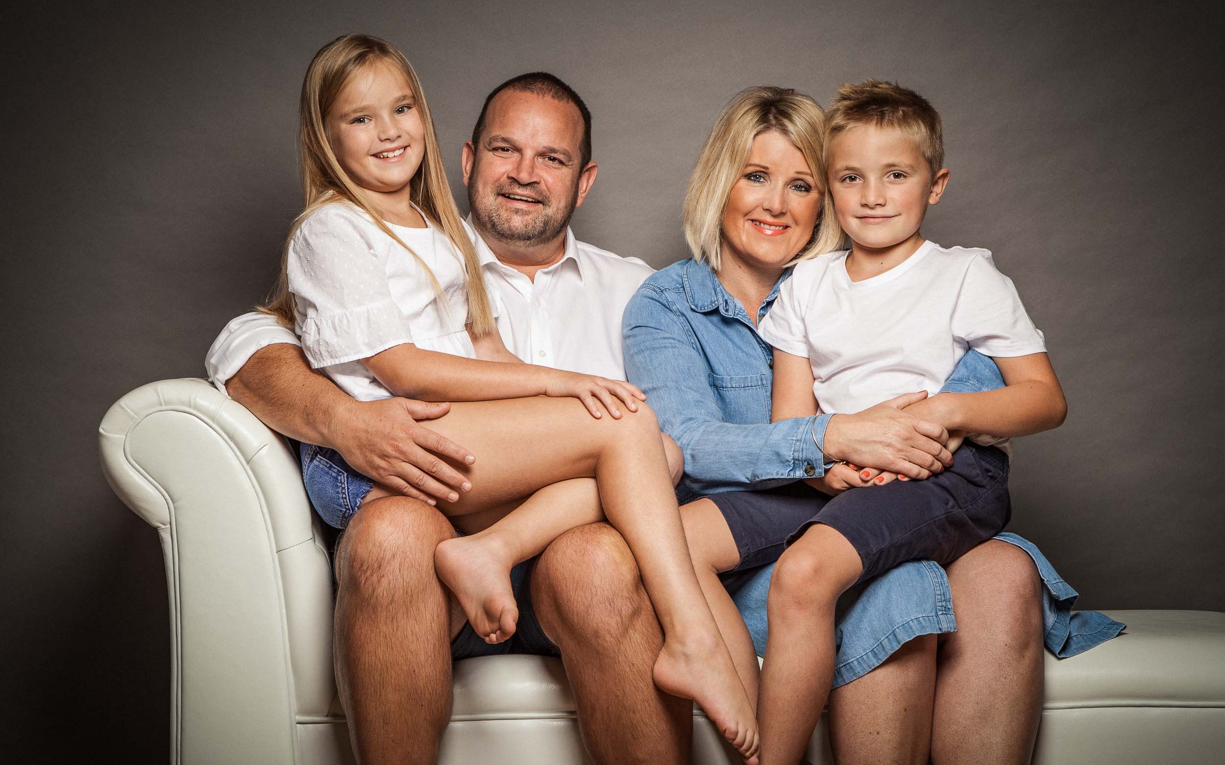
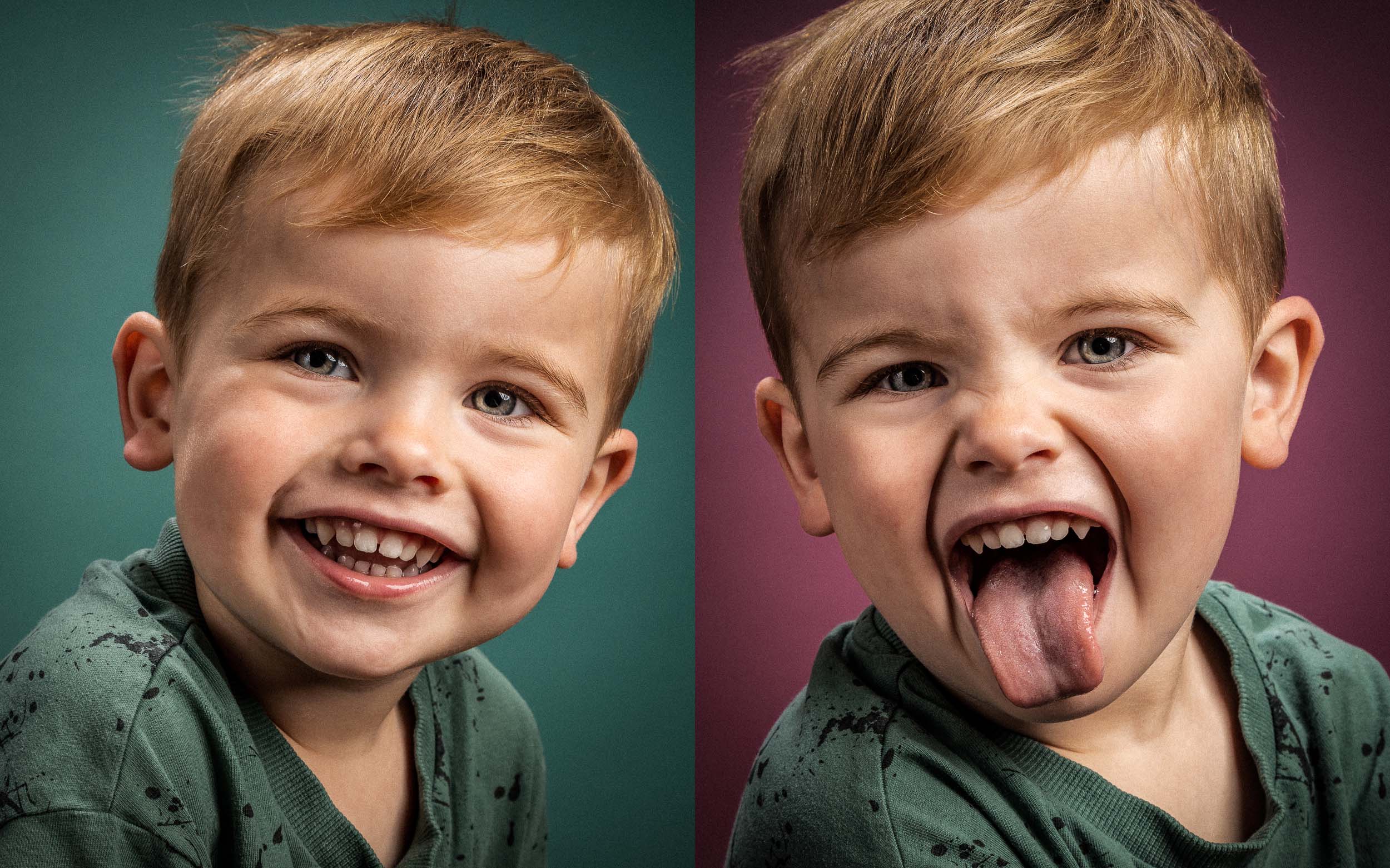
Your family photoshoot will be perfectly designed around your own specific needs and will take place at our cosy Northamptonshire photography studio. It’s suitable for up to 4 siblings and their parents. It can also include grandparents or a well-behaved dog by prior arrangement.
Please don’t worry about your children’s behaviour… as parents ourselves we’ve pretty much seen it all. From the super shy clingy types to the full on Tasmanian devil, we’ve become Jedi masters at dealing with the most challenging of behaviour.
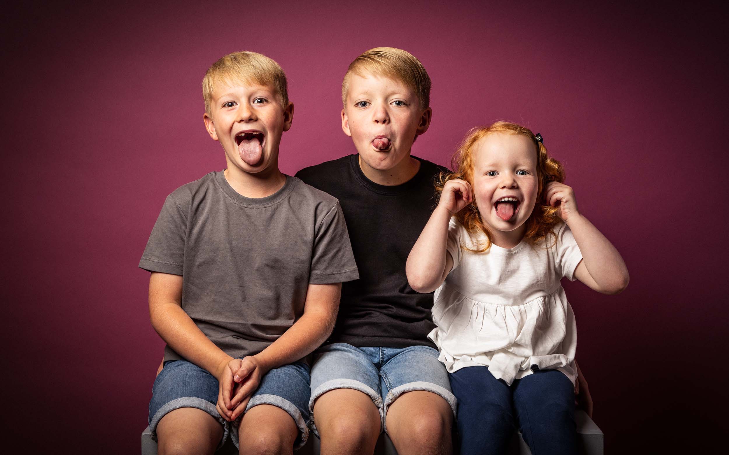
“Andy was great at making the children feel welcome, relaxed and totally at ease to capture beautiful natural images! We would highly recommend Andy for anyone looking for a family friendly, relaxed environment for a beautiful family photoshoot.”
From over 200 5***** Reviews
Book Your Family Photoshoot For Just £50
A £50 deposit will secure your family photoshoot session here at our Northampton Studio and will then be used as credit towards your final order.
Please click here to view our Investment Guide…
Or why not send us a quick message to find out more about our current offers and book your photoshoot: Get in touch…
Further Info About Your Northampton Family Photoshoot
How long will my family photoshoot take?
I understand you’re a super busy parent and that the attention span of a child is pretty rubbish so I’ll try to complete your shoot in around an hour.
Where will my photoshoot take place?
Your family photoshoot will take place at our small, but perfectly formed photography studio here in the Northamptonshire village of Brixworth. Our address is:
4 Spratton Road, Brixworth, Northampton. NN6 9DS
What happens if my child throws a tantrum or misbehaves?
Please don’t worry, we’ve 2 kids of our own so have pretty much seen it all… from the super shy trouser hugger to the full on climbing the wall Tasmanian devil. I’ve been photographing family portaiture professionally everyday for the past 12 years so have become Jedi masters at dealing with, or often ignoring, all sorts of challenging behaviour.
All I do respectfully ask, is that you prevent your children from causing any damage, either to themselves or my very expensive camera equipment!
Will you use photoshop on our children's photographs?
I prefer a light touch when it comes to photoshop and always keeps any post-processing to a minimum… less is more.
I’ll happily remove any temporary blemishes such as acne, slobber, cuts & bruises, flakey skin, snot and bogeys etc. These would only distract from your final portraits and you certainly wouldn’t want to spend the next 25 years staring at a massive snotty nose on your wall!
However, permanent features like freckles, moles or birthmarks will left in all their glory. I’m more than happy to discuss any realistic editing requirements you might have.
5 Hot Tips When Preparing for Your Photoshoot?
A few hot tips to think about before arriving for your family photoshoot…
1. Go for comfortable and plain clothes.
If they’re suited and booted and don’t feel comfy, the likelihood is you’re not going to get the most natural shots. In the same way, don’t give them a ‘special’ hairstyle just for the shoot – you’re going to want to look back at the photographs and remember them how they were day-to-day.Avoid heavily branded clothing or anything super stylish as these items will date your photos much quicker. Likewise, avoid dressing one child in stripes and one in spots.
If you’re having some group family portraits with your children then exactly the same principles apply but please try to all wear similar tones that compliment each other. For example, all dark colours or all light colours work well. It’s your photoshoot so you style it how you like!
2. Don’t over prepare them.
The most successful shoots are the ones where parents haven’t talked about it too much, haven’t made a huge deal out of it and haven’t prepped their kids to be on their best behaviour – it leads to a more natural shoot when things are a bit more off-the-cuff. Let them relax and even be a little bit cheeky.3. PLEASE don’t tell them to say cheese.
This is a big one for me. Portrait photography is all about capturing your child in their most natural, happy state – a forced smile looks hideous and certainly isn’t going to result in the best portrait of your child! Instead, let’s make them laugh and smile.4. Get involved and enjoy your family photoshoot.
One of the most important factors in determining the success of a family portrait session is the attitude of the parents. Those that turn up, hand their kids over and then sit on their phone for the rest of the time rarely get great results. You don’t need to be in front of the camera but you do need to be engaged and involved… no-one knows how to make your children laugh like you do!5. Your Clothes.
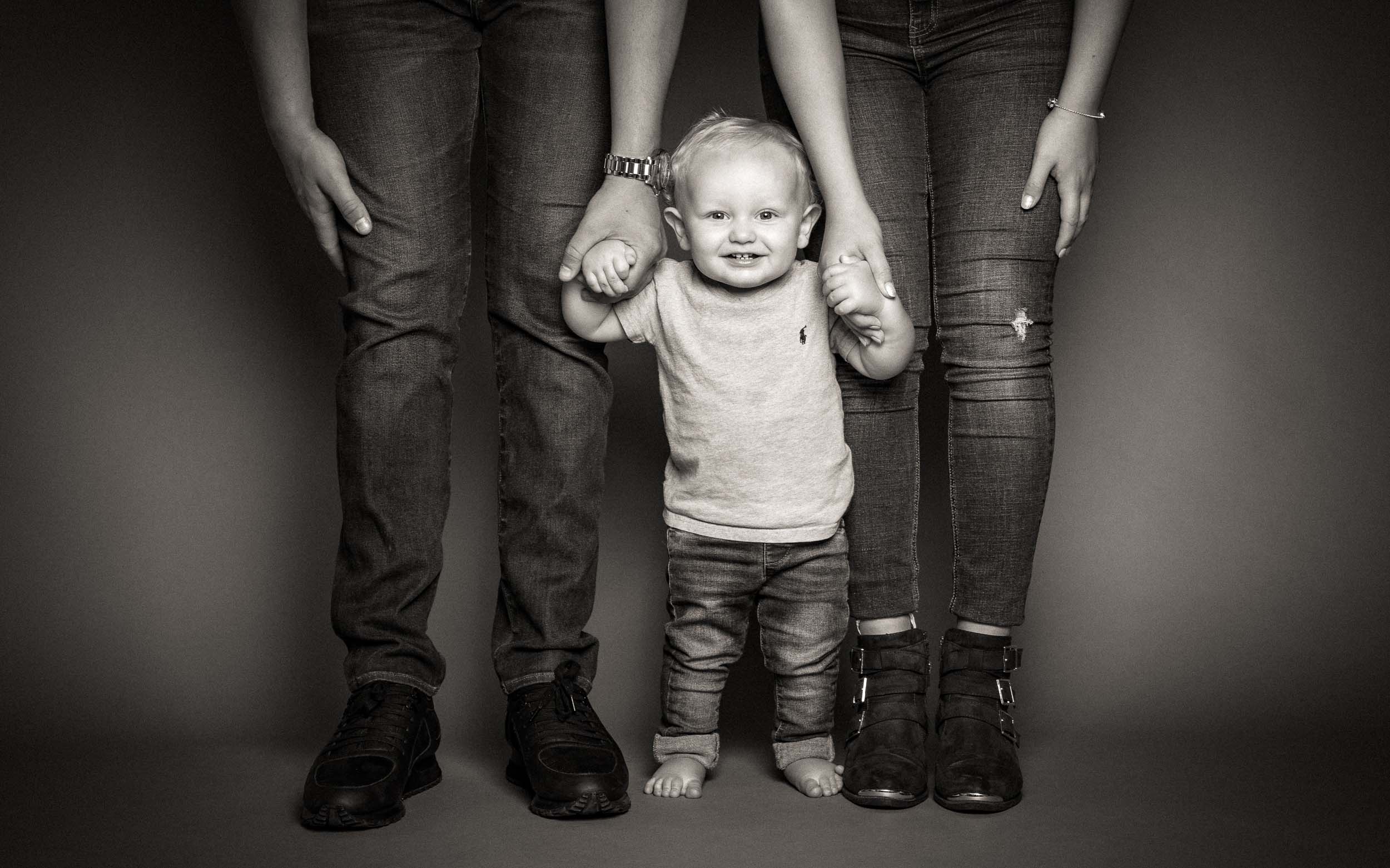
If you’d like to be included in some lovely intimate family portraits with your baby then please make sure you both bring a set of clothes that you’re happy to be photographed in. Simple dark colours work best from experience, especially black, and please try to avoid heavy pattern that may be distracting in the final images.
